Daily Shaarli
April 1, 2022
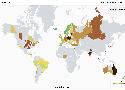
electricityMap is a live visualization of where your electricity comes from and how much CO2 was emitted to produce it.
The map is open source, and improves weekly thanks to 1700 contributors and counting.
The project has an informative FAQ, a list of its data sources, and a wiki.
An interactive 3D visualization of the stellar neighborhood, including over 100,000 nearby stars.
Pretty cool that this kind of visualisation can be run in the browser (Chromium works fine, so does Chrome). But I'm getting no sound, I suppose that's something to do with my machine.
Via Jason Kottke.